Grappige ideeën, felle en zoete kleuren, botsende vormen, grafische lijnpatronen en zwart witte polkadots … Jonge ontwerpers bevrijden zich van verantwoord design en scheppen wild en happy om zich heen. Een nieuwe lichting ontpopt zich op Design Academy Eindhoven tijdens de Graduation Show van Dutch Design Week 2015. Studenten presenteren speels en catchy werk met een gemixte knipoog naar postmodern Memphis Design en Pop Art. Een serieuze stijlbreuk of overwaaiend trendgedrag? Oordeel zelf …


⇧ ‘Electricity is just like … woah’, Dan Adlesic, master Contextual Design
“I am an electrical designer. … I explore the aesthetics of interface components like buttons, plugs and cables, and different ways of interaction. … I use materials made from and inspired by toys. My objects are triggered by a user’s theatrical presence.”


⇧ ‘Rekindling the romance’, Stephanie Goh, Master Contextual Design
“The work reconsiders the centrality of domestic appliances, spatially …The boundaries between the living room, dining room and kitchen, as well as the typologies of objects we associate with these spaces, are blurred.”

⇧ ‘Not Another’, Daniela Treija & Sara Sturges, Bachelor Man and Communication (cum laude)
“”It’s absurd how repetitive design trends have become.” Sara Sturges and Daniela Treija observe that in the era of Pinterest, Tumblr and Instagram there has been an increasing output of similar designs. Where did all the pineapples come from all of a sudden? Every photographer seems to use one for an exotic hint in pictures … And what about all the products made from coloured foam or marble? ‘Not Another’ is a monthly magazine that addresses this issue.”

⇧ ‘Birdie’, Jason Page, bachelor Man and Communication (cum laude)
“When Jason Page sees golf, he imagines a vibrant game played on a golf course built from the words the golfers yell out. Chicken Wing! Worm Burner! Eagle! Birdie! He has created that world in two golf jumpsuits that respect club dress codes but promote an alternative ideology … the game’s visual language is in need of a seriously playful swing.”

⇧ ‘Keep a totem!’ Marica de Michele, student Man and Leisure
“Looking for ways to celebrate a talented newcomer with a ritual, this design is inspired by the symbolic meaning of a totem pole … The stacked set of images in different colours, textures and volumes represent assets such as talent, belief, sacrifice, struggle, and experiment. Important values in pursuing an artistic career.”
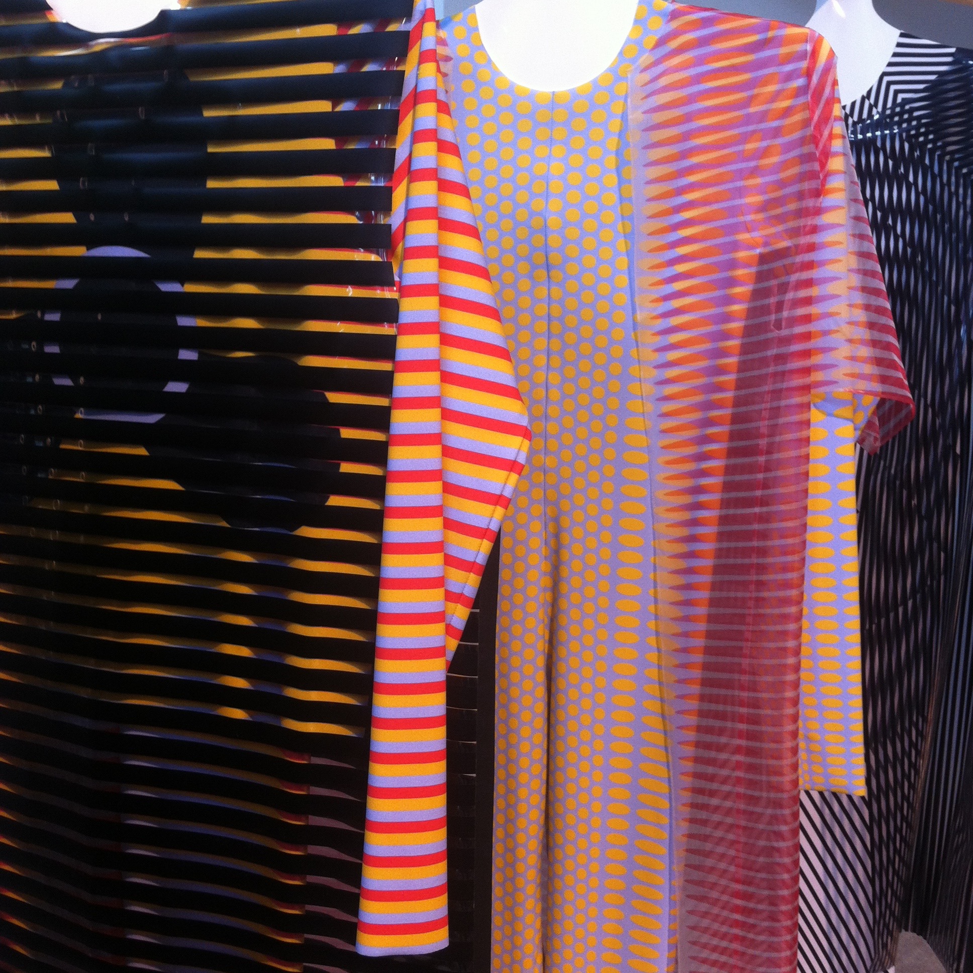
⇧ ‘Print in Motion’, Anouk van de Sande, Man and Identity
“These prints make the spectator dizzy and disordered. Theatrical effects are overwhelming. We are seduced by the playful movement of dancing colors and lines. The collection exists out of catsuits with a superimposed transparent garment. The prints of both layers create an optical illusion when lines cross and colors blend in transparency.”
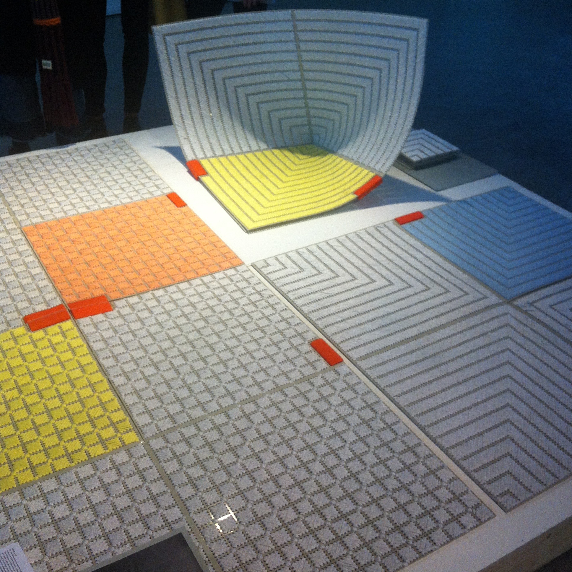
⇧ ‘Wobble – Up’, Sam Linders, bachelor Man and Identity
“Do you like to sit on the floor, to read the newspaper or to be close to the television, curled up or with folded legs? …These carpet tiles can be easily transformed into a wobbling chair by simply folding them into shape and securing them with Velcro.”

⇧ ‘Pop-Up’, Vera de Pont, bachelor Man and Identity (cum laude)
“This colourful piece of textile easily transforms into a coat of your choosing. All you need is a pair of scissors. Vera de Pont has eliminated the time-consuming sewing process with five designs that pop into shape when you put them on – no seams needed … The use of melting yarn prevents the fabric from fraying … Take your pick … and make a new fashion statement.”
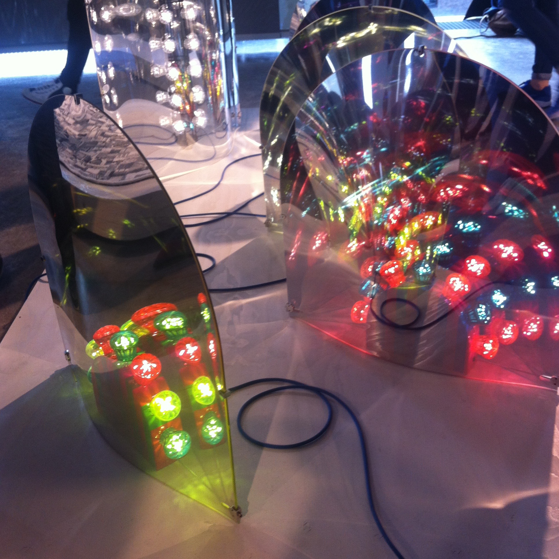
⇧ ‘Space’, Ward Wijnant, bachelor Public Private – Man and Living
“Encased in a curved mirror, each lamp in his series enlarges the reflected living area, creating an illusion of extra space while also dispersing the existing daylight.”
